
How to Optimize Your Website for Mobile: The Ultimate Guide

It only takes a few seconds for your website visitors to decide if they want to stay or bounce away. And the clock ticks faster when they use mobile devices. Considering that, knowing how to optimize websites for mobile is critical to the overall success of your site.
Mobile optimization is an SEO-critical process of setting up the content and layout of your website in a way that it adapts to the screen sizes of different mobile devices.
By focusing on mobile optimization, you can:
- Cater to your complete audience, the majority of which consists of mobile users
- Potentially experience lower bounce rates and higher conversions rates
- Rank higher in the search engine result pages (SERPs)
But how does one go about doing that?
In this in-depth guide, we'll discuss everything you need to know about mobile optimization.
Let's get started.
How to Optimize Your Website for Mobile Devices
Contrary to popular belief, this involves a lot more than simply increasing the size of text and buttons so that they’re easy to read on smartphones and other devices.
With so many boxes to tick and tactics to apply, we believe it’s best to group them into the following three components:
The Site Speed
Site speed, as the name suggests, is the total amount of time it takes to load up a website (calculated by averaging the page views for a sample of landing pages on that website).
How fast your website loads can determine your overall “mobile experience.”
In fact, research shows that 53% of users leave a mobile page if it takes longer than 3 seconds to load.
What can you do about it? Here are a few tactics to get you started:
Compress Images and Videos
Multimedia, such as images, videos, and GIFs, can take their toll on the load speed and ruin user-experience—even more so on mobile devices.
For that reason, you should always compress these files. A plugin like Short Pixel Optimizer or another third-party tool like TinyPNG can help with image compression.
For videos, you can use Free Convert’s video compression tool.
Enable Browser Caching
This isn’t specifically limited to mobile optimization (your desktop users will also love you for it), but browser caching is a good way to cut down on the total load time/page load.
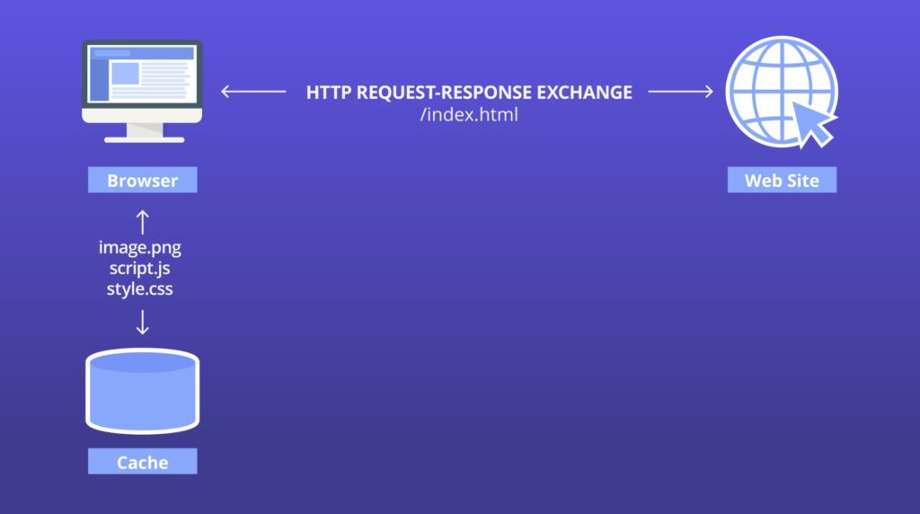
With browser caching, the user’s browser essentially “stores” or “saves” certain elements on your website, and keeps them saved for a specified period of time. If the user decides to return to your website within that time period, the browser won’t have to load those elements from scratch again.
GTMetrix has written an in-depth guide on how to use browser caching.
Use Google PageSpeed Insights to Track Performance
Last but not least, make sure to run your website on the Google PageSpeed Insight tool.
This tool rates the speed of your website on a scale of 0 to 100, highlights the potential, underlying problems, and even suggests fixes.
Keep checking your website on this tool from time to time to identify any possible speed issues.
Adaptation of Content
The way your content shows up on the mobile screen can make or break the user experience.
Here’s what you can do about it:
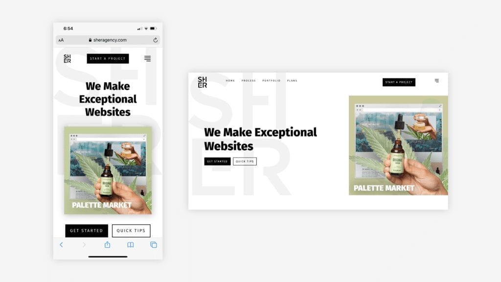
Use Responsive Web Design
First and foremost, make sure that your website has a responsive design (one of our top 5 things to consider when building a website).
To recap, a responsive website is one that adapts its content and layout to a different window and/or screen sizes using CSS media queries.
To check if you have a responsive website, simply open your website on a smartphone and see if the elements adjust to the smaller screen size.
Make the Content Snackable
A good rule of thumb that should be followed in every mobile site is to “display one thought, message, or element at a time on the screen.”
In simple words, this means showing only a section of a section (sometimes even further) to the user at a time.
For instance, if you have a section with 4 snackable paragraphs (3-4 lines each), the user should ideally see one of those paragraphs on the screen at a time while scrolling.
Increase the Size of Text
Make sure that the mobile version of your website is set up to increase the size of the text (to fit small screens).
Ideally, a user should be able to go through the entirety of your content without having to pinch and zoom in.
Ditch Mobile-Unfriendly Elements
Three of the most common culprits that could drive your mobile visitors away include:
- Sidebars
- Pop-ups
- Other Sticky Elements
Make sure that they don’t appear on the mobile version of your website.
Overall Usability of the Website
The third and final component of a mobile-optimized website is usability.
If certain functionalities (that usually work on your desktop site) don’t work on the mobile version, fix them right away.
Here are a few tips:
Make Navigation a Breeze
Is your mobile website easy to navigate?
Confusing mobile design is the last thing you want. Make sure that navigating between different web pages is a breeze by:
- Using a hamburger/collapsible menu
- Internally linking to relevant pages
You can also use “breadcrumb navigation” to show the users where they stand and how far along they’ve come from the homepage.
Increase the Size of Buttons/CTAs
On a desktop computer, clicking on a button with a cursor is no problem. But when that cursor is your fingertip, things can get a bit challenging.
Considering that, make sure that the size of your CTA buttons is significantly larger.
Avoid Using Flash at All Costs
Finally, make sure that your website isn't using Flash—an old-school authoring software used for creating graphics-based animation.
Both Apple’s iPhones and Android smartphones don’t support Flash. Remove it right away and stay clear of anything flashy.
You can instead use CSS3 and HTML5 to create animations.
Ending Note: Mobile Optimization is a Continuous Process
As with everything else, mobile optimization isn’t a sprint, but an ongoing marathon.
Even when you set everything up, keep checking your website on an auditing tool to ensure that it’s properly optimized for mobile devices.
5 Easy Ways to Boost Your Conversion Rate in 5 Days
"*" indicates required fields